Sainsbury’s
PRODUCT DESIGN
UI
UX
SERVICE DESIGN
.png)
The Project Brief
As part of the service design module for my MA in design management and entrepreneurship at DMU, we had a project brief from the Sainsbury’s design team.
The brief itself required the team to come up with design solutions around how Sainsbury’s as a retailer can create new digital and in-store experiences that assist in creating a diverse and inclusive community.
Role
Responsible for leading the team and conducting user research, product design, prototyping, usability tests and brand design
The Team
1 × product designer
2 × interior designers
2 × digital designers
Year
2023

In interpreting the design brief, we ensured that the design solution and experience drove inclusivity and was open to people of all backgrounds with an emphasis on how periodically people might come together, how their colleagues could participate in this experience and how the solution offered enhance the overall customer experience.
We also considered the use of their physical stores to digital facilitation ensuring that we reflected the warmth of the Sainsbury’s brand while creating a delightful experience for its customers.
Prior iterations of the design solution
The design solutions had gone through two prior iterations. The first iteration of design solutions and concepts were presented to the Sainsbury’s team using MS Teams and the second was an in-person presentation to the team.
Using the double diamond design methodology at each iteration, we worked convergently and divergently to identify issues and challenges that existed with the current World Foods offerings at Sainsbury’s and develop solutions to them.
Auto ethnography, mystery shopping and an explorative service safari were invaluable in giving us insights into the problem areas and opportunities for improvements.
Our design solution was centered around an inclusive omni channel experience that integrated both physical and digital touch points to deliver a delightful Foods festival to the customers achored around the following key areas:


My approach to improving the existing design solutions
Working as an independent designer, i was tasked with improving and further iterating on the findings and design solutions presented by the team.
In this iteration, I conducted further research to gather stakeholder feedback and improve the user-centered design of the solution.
This involved problem exploration, qualitative contextual user interviews, usability testing, and surveys to gather information about users. Secondary research was also conducted to explore UX laws, industry standards. I also tested the usability of the design among users and their feedback was insightful in improving the design solution.


Case studies of my focus areas
Click on one to know more


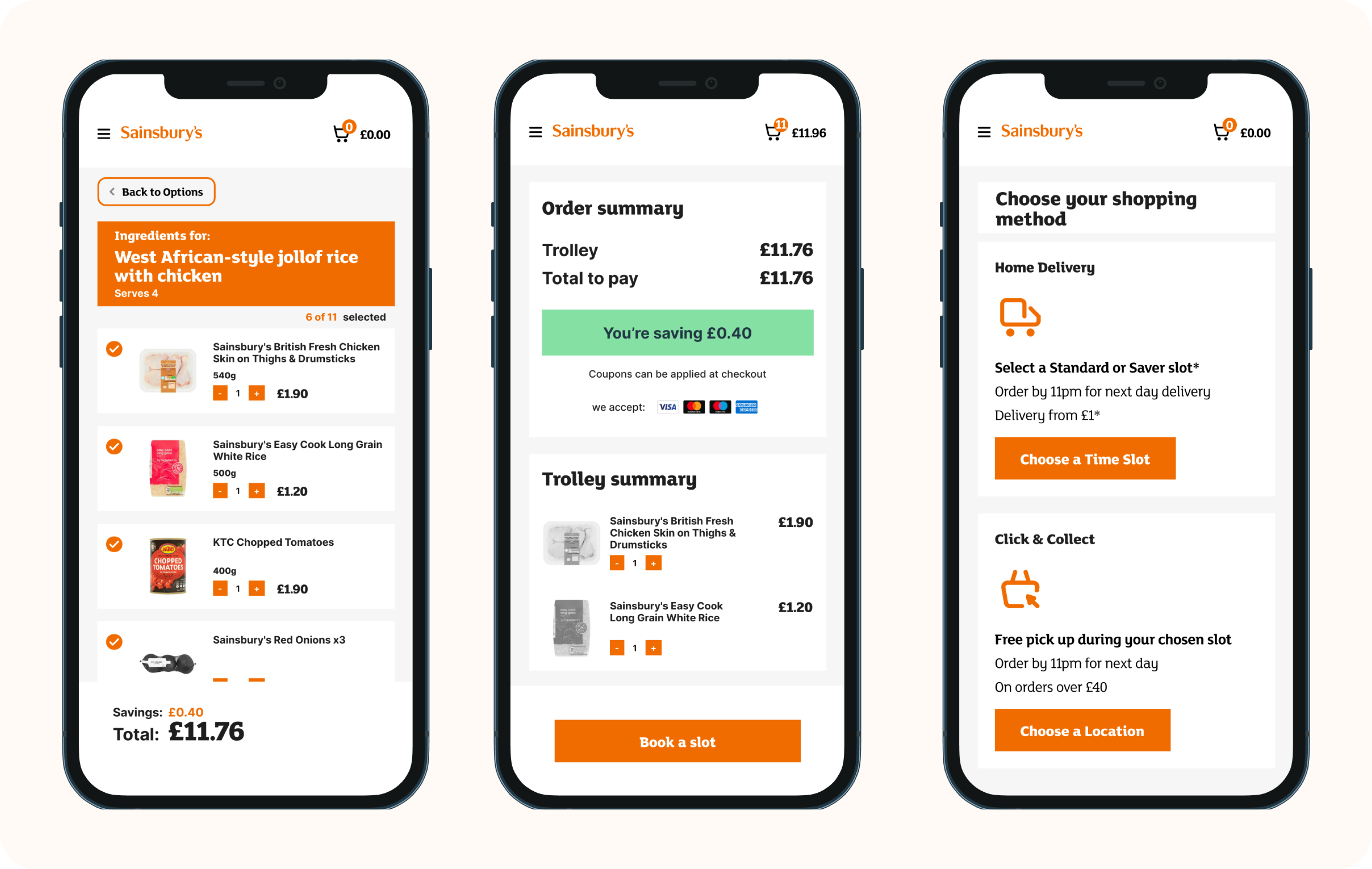
Enhancing the world foods mobile web user shopping experience
Understanding how users view the proposed mobile web shopping experience
User interviews were conducted in order to understand the customer’s experiences, preferences and pain points with the proposed solution and what opportunities exist to improve this solution.
Usability tests was also conducted using the mobile prototype and the participants were able to interact with the live interactive prototypes and give their feedback. The goals of this usability test were to Identify problems in the design solution, Uncover opportunities to improve the design Learn about the participants behaviour and preferences.
In addition a survey was conducted to collect quantitative and qualitative data about customers interactions and their experiences with online and in-store shopping, QR code scanning, behaviours for shopping online and in-store, pre-packaged fake-aways and recipes amongst others.
Some insights from the user interviews

Usability tests - Mobile QR shopping and scanning experience

Usability tests - In-store handset shopping and scanning experience

Findings from research
🤳🏼 customer existing mental models with QR codes was to open a link or read information rather than partake in shopping
🛒 customers enjoy trying out new recipes, but they dont necessarily shop for ingredients online.
🥘 customers want flexibility of switching ingredient options when trying out recipes
📝 Providing clear instructions about a QR code is a big factor in whether users scan QR codes or not
🤷🏽 Clear information about mini pack servings, recipe and ingredients were important after a code was scanned
🥬 Diversify the recipe addon options to be more inclusive and diverse with a vegan option
🥡 Mini-packs felt complimentary and not like an option
🚦 User navigation was sticky and users couldn't easily navigate back and forth between options
Synthesizing research findings using an affinity map

Adhering to design system guidelines
In ensuring that the proposed UI and UX designs were compliant with Sainsbury’s standards, the luna design system was an important repository of UI components and design guidelines.
These guidelines provided a basis for the design and also aided how ideation and innovation around the delivery of new concepts were developed and presented to the customers

Storyboards
As designers, storytelling plays a large role in providing clarity and inspires teams and stakeholders.
Storyboards were used to illustrate the sequence of steps graphically, in an easy-to-understand manner to the stakeholders. This captured the integrated omni-channel and customer experience navigating the various ideas generated and touch points identified.

A summary of the customer journey and shopping stages


Making Mini Packs More Visible
Findings from research (user interviews and usability tests) show that pre packaged mini packs did not feel like an option to the ingredients.
This guided the decision to make the packs more prominent and show it as an option
A more visible recipe and ingredients tab
Usability testing found pain points with the current home screen after scanning a QR code on mobile.
Users wanted to see recipes and ingredients on the page as well as the CTA button to place an order.
To fix this, a view recipe tab was added to the recipe page.
Design decisions were made to be consistent with the current user's expectation of how tabs work on other websites as well as within the current Sainsbury’s website and design system.


Swapping and editing suggested recipe items
I observed and heard from users that they wanted to be able to edit and swap recommended ingredients based on their budget, so a tab for budget, standard, and premium recommendations was added.
A swap button and editable checkbox were included to allow users to change specific items in the trolley.
Making the options more inclusive
Research showed that users desired vegan recipe options, which aligns with the brief's focus on inclusivity.
Users also found the flow confusing, prompting the creation of a new flow where they must select an option before proceeding.


Giving customers agency to determine serving quantity
Customers were confused about the mini pack options and preferred them to be bundled as one pack.
To address this, the mini packs were bundled and customers were given the ability to choose serving quantities, which they had expressed a need for.
An input box was added for users to enter the number of servings, with a minimum of 1 serving per mini pack.
Fixing navigation flows
When customers add their items to the trolley, they stated confusion with the limited options of navigation choices.
To solve for this, an extra button was added to help users navigate to continue to shop for other items.
Navigation buttons were also introduced to aid the user flow

Leveraging on the the in-store handset touchpoint for an elevated customer experience
Findings from research
From the survey conducted, over 70% of the respondents had never used the in-store handsets to shop before.
Additionally, over 80% of respondents had indicated an interest in actually trying out the proposed solution of using the in-store handset to add ingredients to their trolley while shopping.
There was also a low awareness of the world foods offerings and recipes among respondents even though Sainsbury’s had a dedicated recipe section on its website.
To be able to gain further insights, usability tests were conducted with the in-store handset prototype to be able to explore opportunities for an improved experience.
How might we improve the shopping and scanning user experience on the in-store handset when shopping for ingredients for recipes?
Replicating the in-store handset user experience for research


Differentiating scanned and unscanned items
Usability testing showed a pain point in distinguishing between scanned and unscanned items and showing recipe items in the shopping trolley.
This drove the decision to introduce a new “trolley view” and implement a “view items left” button. The number of items left to be scanned were also highlighted and it also toggled the trolley view.


Adding aisle numbers for ingredients
From research, customers wanted easier in-store navigation for ingredients.
This guided the ideation around signposting aisle numbers to unscanned items.
Recommended ingredients removal and swapping
A key insight from customers is that they wanted to be able to remove scanned items and swap products, so this directed our decision to update the design to allow users to do so by tapping on the item and choosing the desired action.
The constrains of the screen real estate were considered while implementing this solution.


Improving navigation between the screens
From research, customers found it hard to navigate back to the recipe page.
To solve this, a navigation back icon button was added on the handset. The solution took into consideration the usable area of the device
A more usable QR code flier for customer conversion
Findings from research
From research and tests conducted, there was a need for more clarity on the instructions on the QR flier.
Testing showed that the expected user behavior and perceptions were different from what was anticipated in scanning the QR to shop because their mental models, backgrounds, and goals vary.

In consideration of this, the QR code flier design was updated to provide more simple steps that aid the user in completing the task of scanning the code on either their mobile phone or in store handset and completing the task.
By seeing how the user’s interacted with the fliers and instructions on them, it was evident that the initial design had some assumptions which included the interpretation of iconography by the customers with little text copy to give proper instructions.
Creating brand assets for an omni channel world foods experience
I created high fidelity designs and mock-ups to showcase their refined solutions and real-life scenarios for the physical space and online solutions.
These included tactile artifacts such as posters, signages, and vouchers for the final presentation.
Posters and Fliers


In-store signages and banners


Mockups

